Recipe4Good
Recipe4Good transforms meal planning by addressing food waste, offering healthy meals, and supporting global hunger initiatives. The app reduces food waste by suggesting the perfect ingredient amounts, promotes healthy eating, and partners with organizations like Sobeys, the Canadian Red Cross, and the United Nations to combat hunger. Inspired by the Red Cross’s persuasive donor texts, the UN’s Zero Hunger goal, and Sobeys’ shopping list feature, Recipe4Good enhances user experience with unique features like a donation model and badge system. Targeting socially conscious individuals, Recipe4Good encourages users to positively impact their health and the world.

Design Thinking Process
Empathize Stage
In the empathize stage, we investigated multiple audiences to understand which would suit an app like Recipe4Good. During 2020, when COVID-19 shut down the world globally, it was found that the demand for ordering from third-party delivery apps increased (MacLeod, 2021). Due to this, we wanted to understand and provide a way for users to learn how to cook and build a healthy relationship around it so that they can foster their skills, donate to a good cause, and save money from upcharges on delivery apps. At the same time, we wanted to recognize potential food restrictions that a user might have so that we could reach a wider audience, no matter their preference for food. Ultimately, Recipe4Good strives to be accessible to all types of users and hopes to diminish any uncertainties with cooking, diets, sustainability, and cooking skills.
Define Stage
In the define stage, we converged and synthesized our research from the empathy stage to determine our user goals, challenges they faced, pain points and define the problem and purpose of the app. The goal of the app is to teach and improve one’s hospitality abilities at the comfort of their home, making it accessible, convenient, and enjoyable. It provides personalized recipes and easy-to-follow instructions to guide users through the cooking process, while also enabling them to shop for the ingredients used in the recipes without needing to go to grocery stores and donate money to food charities, all within one app. This initiative aims to persuade and encourage individuals to cook more often, reduce the urge to order takeout (save money), and foster a deeper connection with their community. In doing so, personas were created to help visualize the problem and better understand users' needs.
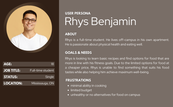
Personas
Primary Persona

Secondary Persona
Ideate Stage
In the ideate stage, we diverged from our research to come up with multiple potential design layouts to create an app that offers an effective user experience for learning how to cook, shop, and donate within one platform. To effectively create this app, a sitemap was developed to organize the ideas regarding the overall flow of the app and provide a visual representation and clear overview of how the different pages are connected. This, in turn, allows for the brainstorming of different potential layouts for the pages, helping to facilitate the hierarchy of information to ensure that the user flow of using the app is easy for users to navigate while accomplishing their goals and purposes for using the app.
Site Map

Wireframes
Low-fidelity


Based on the different brainstormed layout ideas, we decided to combine various design layouts to ensure a smoother user flow. The initial brainstorming layout established a simple and clear user flow and hierarchy for navigating between pages, catering to the targeted users’ needs. However, the second version of the food category makes more sense for the app’s purpose, allowing users to filter ingredients and time of day by checking boxes, simplifying the process of selecting a dish and following instructions to prepare it. Furthermore, the shop page follows a similar sequence to the first idea. However, as a group, we decided that the initial page would be more effective if users could type the names of the ingredients, which would then be added to a list view on the page.
Storyboard
Panel 1: Rosa Anderson is coming home from a long day at work, tired of wasting money and not knowing what dish to cook that can be easy.
Panel 2: She downloaded the Recipe4Good app and opened it.
Panel 3: Within the app, she filtered out the specific needs to match her preferences.
Panel 4: After going through the options, she decided to settle on a simple salad for dinner.
Panel 5: Following the easy step-by-step recipe, she cooked the dish.
Panel 6: By using the app, Rosa now completed a homemade dish with ease in the comfort of her own house.

Prototype App Result


Challenge
During user testing, we encountered a significant challenge with the app’s navigation. Users struggled with finding their way through the app due to the lack of essential navigation features, such as back buttons and intuitive menus. This issue created friction in the user experience, hindering smooth interactions. To address this, we conducted a redesign of the app, incorporating clear and accessible navigation elements. The prototype was adjusted to include a back button, improved menu structures, and better flow to ensure a more seamless experience. After these adjustments, users found the app easier to navigate, improving overall usability.
Example:
